NAIROBI, The Mercator world map, long a fixture in classrooms globally, makes the European Union appear almost as large as Africa. In reality, Africa is more than seven times bigger.
It is a distortion that has prompted a new African initiative, “Correct the Map”, calling for depictions that show Africa’s true scale.
“For centuries, this map has minimised Africa, feeding into a narrative that the continent is smaller, peripheral and less important,” said Fara Ndiaye, co-founder of Speak Up Africa, which is leading the campaign alongside another advocacy group, Africa No Filter.
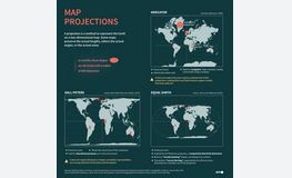
Accurately translating the Earth’s sphere into a flat map always calls for compromises, requiring parts to be stretched, cut or left out, experts told AFP.
Historically, maps have reflected the worldview of their makers.
Babylonian clay tablets from the sixth century BC placed their empire at the centre of the world, while medieval European charts often focused on religious sites.
Choices must be made: a world map will look very different depending on whether Australia, Siberia or Europe is placed at its centre.
Today’s most-used map was designed for maritime navigation by Flemish cartographer Gerardus Mercator in 1569.
It focused on accurate depictions of the shapes and angles of land masses, but their relative sizes were often inaccurate.
Mercator’s projection inflated northern regions and compressed equatorial ones, making Europe and North America appear much larger, while shrinking Africa and South America.
The distortions are stark: a 100-square-kilometre patch around Oslo, Norway, looks four times larger than the same area around Nairobi, Kenya.
Greenland appears as large as Africa, even though it is 14 times smaller.
– Striking a balance –
Alternatives to the Mercator emerged in the 20th century, including one from 1921 by Oswald Winkel and another in 1963 by Arthur Robinson that reduced distortions but sacrificed precision. The 1970s Gall-Peters projection restored proportional sizes but stretched shapes.
To strike a balance between accuracy and aesthetics, cartographers Tom Patterson, Bojan Savric and Bernhard Jenny launched the Equal Earth projection in 2018.
It makes Africa, Latin America, South Asia and Oceania appear vastly larger.
“Equal Earth preserves the relative surface areas of continents and, as much as possible, shows their shapes as they appear on a globe,” Savric told AFP.
This is the projection now endorsed by the African Union.
Speak Up Africa says the next steps of their campaign are to push for adoption by African schools, media and publishers.
“We are also engaging the UN and UNESCO (its cultural body), because sustainable change requires global institutions,” Ndiaye said.


